As Tad mentioned in previous posts, rhythmic variation is one of the key distinguishing features of jazz. We’ve been specifically interested in analyzing how drummers can create a different feel by playing “ahead of” or “behind” the beat (whatever that might mean). In this post, I’ll cook up a visualization method to give a detailed view of rhythm and tempo variation.
Where’s the beat?
If we want to quantify how ahead or behind the beat a drummer is playing, the first thing we might want to do is find the beat. Issues of circularity aside, beat tracking can be notoriously tricky in jazz.
Let’s simplify things a bit and not worry about tracking beats. A typical beat tracker works by finding (approximately) regular intervals in the song that have strong onsets: that is, times at which spectral energy increases, like when a note is first sounded.
This can be visualized on a short (~3 second) audio fragment:
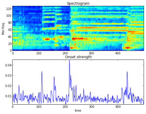
where the top image displays the amount of spectral energy in each (Mel-scaled) frequency band over time, and the bottom plot shows the onset envelope aggregated across all frequency bands.
When all instruments are playing in sync, the onsets will coincide in time, leading to a highly peaked onset envelope. However, when instruments are staggered relative to each-other in time, the onset envelope becomes much more noisy (as happens just after time 400 in the above plot), which eventually will confuse beat trackers.
Can we quantify this effect? Ideally, we’d compute onsets for each instrument separately and correlate them across time. But, since we don’t generally have cleanly separated, multi-track recordings, we’ll take onsets from different frequency sub-bands as a first approximation.
Correlating onsets
Displaying all possible cross-correlations could easily get overwhelming. Let’s simplify things further and ask: how do the onsets extracted from frequency band  compare to the total onset envelope?
Let  denote the onset strength at time
  restricted to frequency band , and
  will denote the reference onset envelope extracted from all channels (i.e., the typical input to a beat tracker). I’ll assume that each
  has been appropriately normalized to 0-mean and unit variance across the entire song.
We can then look at the correlation between  and
and  over a window of time (say,
  1.5 seconds). Stacking these correlation plots together, we get a matrix
  defined by
![\[ H_{f,t} = \mathbb{E}_T \left[ \mathcal{O}^r(T) \cdot \mathcal{O}^f(T+t)\right]. \]](wp-content/ql-cache/quicklatex.com-248ef123ea81505c8c7ad72d85f4e622_l3.png "Rendered by QuickLaTeX.com")
Displaying this matrix as an image should give a sense of how synchronized each frequency band is with the global onset profile.
Examples
As a sanity check, let’s try it out on something with a rigid, synchronized beat. How about Kraftwerk – Spacelab?
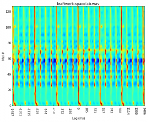 So far so good: everything’s lined up almost perfectly with uniform timing. (Note: for the purposes of visualization, each row of the matrix was normalized by its maximum value.)
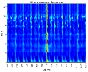
Next up, one of the Autumn Leaves renditions that was problematic for the beat tracker:
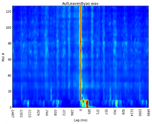
Here, we can see that the low end is consistently late, and not aligned to the reference onsets. It’s not too surprising that this might confuse a beat tracker.
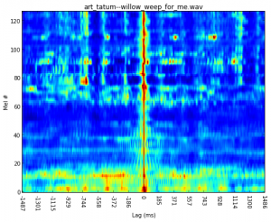
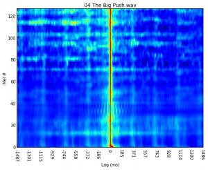
Back to Tony Williams on The Big Push:
Elvin Jones on Speak No Evil is slightly more vertical (synchronized) and has clear dang-dang-da structure in the low bands:
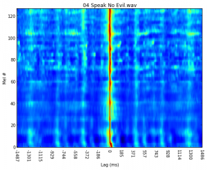
It might be worth noting that in Speak No Evil, the dangs line up vertically with most frequency bands, but the das don’t, which may be a cue that the das are perceived as occurring after the main beat. It’s less obvious what’s going on in The Big Push: the dang-dang-da pattern is less clear, and there’s a bit more low-frequency correlation ahead of the main beat (lag -100) than in Speak No Evil.
So we haven’t quite solved the ahead-or-behind problem yet, but visualization is a useful first step. Of course, partitioning onset detectors by frequency band may not be the best way to go, especially if we’re after percussive instruments that tend to be spread across wide frequency bands, rather than precise harmonics. Clearly more work is required!
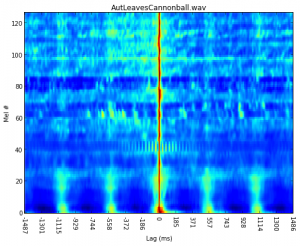
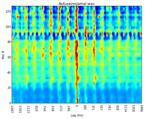
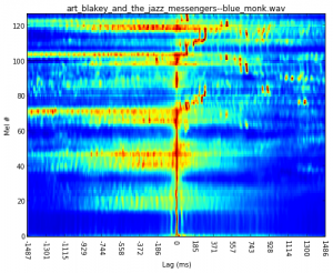
Just for fun, here are a few more examples with varying degrees of complexity.