|
| <-- Back to Previous Page | TOC | Next Section --> |
Chapter 3: The Frequency DomainSection 3.1: Frequency Domain
|
||
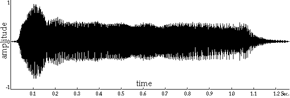
Time-domain representations show us a lot about the amplitude of a signal at different points in time. Amplitude is a word that means, more or less, "how much of something," and in this case it might represent pressure, voltage, some number that measures those things, or even the in-out deformation of the eardrum. For example, the time-domain picture of the waveform in Figure 3.1 starts with the attack of the note, continues on to the steady-state portion (sustain) of the note, and ends with the cutoff and decay (release). We sometimes call the attack and decay transients because they only happen once and they don’t stay around! We also use the word transient, perhaps more typically, to describe timbral fluctuations during the sound that are irregular or singular and to distinguish between those kinds of sounds and the steady state. From the typical sound event shown in Figure 3.1, we can tell something about how the sound’s amplitude develops over time (what we call its amplitude envelope). But from this picture we can’t really tell much of anything about what is usually referred to as the timbre or "sound" of the sound: What instrument is it? What note is it? Is it bright or dark? Is it someone singing or a dog barking, or maybe a Back Street Boys bootleg? Who knows! These time domain pictures all look pretty much alike.
Figure 3.1 A time-domain waveform. It’s easy to see the attack, steady-state, and decay portions of the "note" or sound event, because these are all pretty much variations of amplitude, which time-domain representations show us quite well. The amplitude envelope is a kind of average of this picture. |
||
|
|
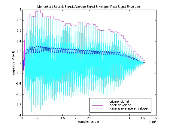
Figure 3.2 Monochord sound: signal, average signal envelope, peak signal envelope. |
|
|
|
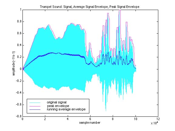
Figure 3.3 Trumpet sound: signal, average signal envelope, peak signal envelope. Two Sounds, and Two Different Kinds of Amplitude EnvelopesThe two figures and sounds in Soundfiles 3.1 and 3.2 (one of a trumpet, one of a one-stringed instrument called a monochord, made for us by Sam Torrisi) illustrate different ways of looking at amplitude and the time domain. In each, the time-domain signal itself is given by the light blue area. This is exactly the same as what we showed you at the beginning of this section in Figure 3.1. But we’ve added two more envelopes to these figures, to illustrate two useful ways to think of a sound event. The magenta line more or less follows the peaks of the signal, or its highest amplitudes. Note that it doesn’t matter whether these amplitudes are very positive or very negative; all we really care about is their absolute value, which is more or less like saying how much energy or displacement (in either direction). Sometimes, we even simplify this further by measuring the peak-to-peak amplitude of a signal, just looking at the maximum range of amplitudes (this will tell us, for example, if our speakers/ears will be able to withstand the maximum of the signal). In Figure 3.2, we look at some number of samples and more or less remain on the highest value in that window (that’s why it has a kind of staircase look to it). The dark blue line is a running average of the absolute value of the signal, which in effect smooths the sound out tremendously, and also attenuates it. There’s a similar measure, called RMS (root-mean-squared) amplitude, that tries to give an overall average of energy. Once again, we used a running window technique to average the last n number of samples (where n is the length of the window). Different values for n would give very different pictures. Just to give you some idea how we generate these kinds of graphs and measurements, in Xtra bit 3.1 we’ve included the computer code, written in a popular mathematical modeling program called MatLab, that made these pictures. By studying this code and the accompanying comments, you can get some idea of what computer music software often looks like and how you might go about making similar kinds of measurements. The Frequency/Amplitude/Time Plot |
|
|
|
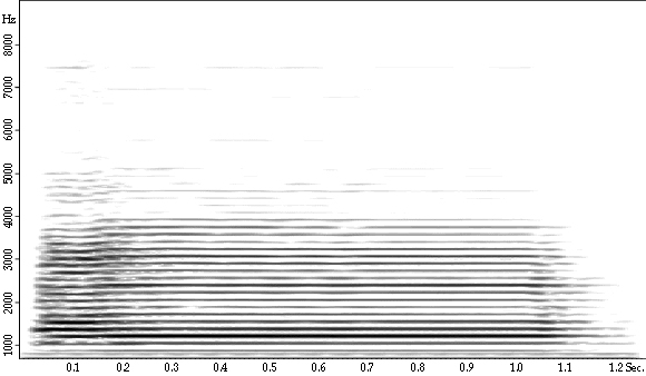
Distinguishing between sounds is one place where the frequency domain comes in. Figure 3.4 is a frequency/amplitude/time plot of the same sound as the time-domain picture in Figure 3.1. This new kind of sound-image is called a sonogram. Time still goes from left to right along the x-axis, but now the y-axis is frequency, not amplitude. Amplitude is encoded in the intensity of a point on the image: the darker the point, the more energy present at that frequency at around that time. For example, the semi-dark line around 7,400 Hz shows that from about 0.05 second to 0.125 second, there is some contribution to the sound at that frequency. This is occurring in the attack portion. It pretty much dies after a short period of time.
Figure 3.4 This picture shows the same sound as that of the time domain in Figure 3.1, but now in the frequency domain, as a sonogram. Here, the y-axis is frequency (or, more accurately, frequency components). The darkness of the line indicates how much energy is present in that frequency component. The x-axis is, as usual, time. What does this sonogram tell us about the sound? Remember that we said
before that we use the entire frequency range to determine timbre as well
as pitch. As it turns out, any sound contains many smaller component sounds
at a wide variety of frequencies (we’ll learn more about this later;
it’s really important!). What you’re seeing in this sonogram
is a representation of how all those component sounds change in frequency
and amplitude over time. |
|
|
|
Now listen to Soundfile 3.3 at left. The sonogram shows that the mystery sound starts with a burst of energy that is spread out across the frequency spectrum—notice the spikes that reach all the way up to the top frequencies in the image. Then it settles down into a fairly constant, more concentrated, and lower energy state, where it remains until the end, when it quickly fades out. This is a pretty common description of a vibrating system: start it vibrating out of its rest state (chaotic, loud), listen to it settle into some sort of regular vibratory behavior, and then, if the energy source is removed (for example, you stop blowing the horn or take your e-bow off your electric guitar string), listen to it decay (again, chaotic). The presence of a band of high-amplitude, low-frequency energy coupled with some lower-amplitude, high-frequency energy implies that we’re looking at some sort of pitched sound with a number of strong harmonics. The darkest low band is probably the fundamental note of the sound. By studying the sonogram, can you get a mental idea of what sort of sound it might be? Listen to the sound a few times while watching the waveform and sonogram images. Can you follow along? Is there a clear correlation between what you see and what you hear? Does the sound look the way it sounds? Do you agree that the sonogram gives you a more informative visual representation of the sound? Isn’t the frequency domain cool? |
|
|
|
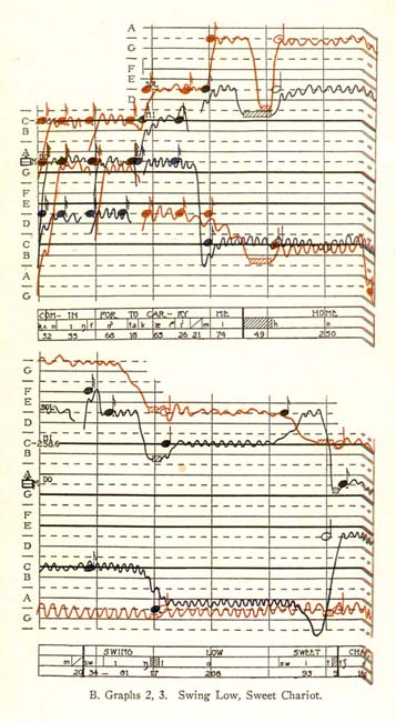
Figure 3.5 Song of the hooded warbler.
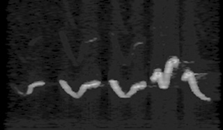
Figure 3.6 Just for historical interest, the picture above is an example of an old process called phonophotography, an early (1920s) method for capturing a graphic image of a sound. It’s essentially a melographic technique. |
| <-- Back to Previous Page | Next Section --> |
©Burk/Polansky/Repetto/Roberts/Rockmore. All rights reserved.